Tuesday, 19 November 2013 09:38

All Template's Positions

Written by
Rate this item
(0 votes)

JM Doctor Joomla template is using fully responsive layout that adjusts to various screens: desktops, tablets or mobiles.
EF4 Framework includes Layout Builder tool which allows you to customize template layout for different screen dimensions.

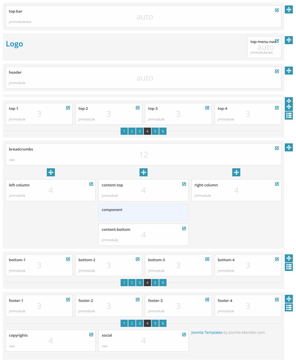
Module positions for normal and large screen usually desktop and tablet landscape (980px and higher)

Module positions for normal and large screen

Check out more details about layout customization!

Module positions for medium screen usually tablet (768px-979px)

Module positions for medium screen

Check out more details about layout customization!

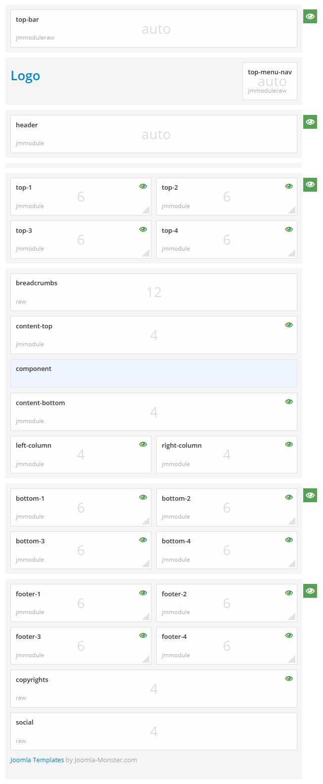
Module positions for small screen usually tablet portrait and mobile landscape (481px-767px)

Module positions for small screen

Check out more details about layout customization!
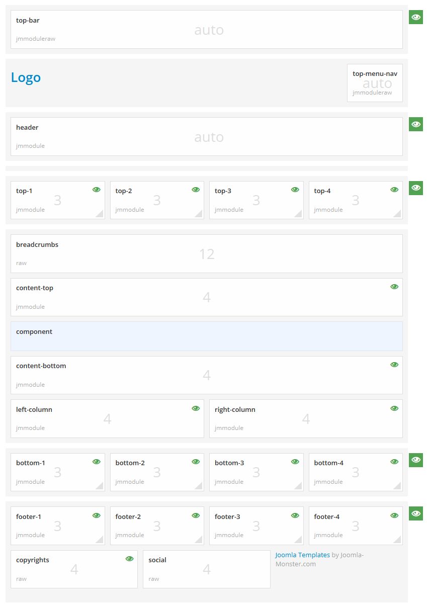
Module positions for extra small screen usually mobile portrait (480px and smaller)

Module positions for extra small screen

Check out more details about layout customization!
Read 10326 times Last modified on Thursday, 18 December 2014 10:08
More in this category: « Content Area Module Suffixes »

Leave a comment

Make sure you enter all the required information, indicated by an asterisk (*). HTML code is not allowed.